Silence as a Feature: How the Ancient Japanese Idea of Ma Is Quietly Rewiring Silicon Valley's Design Playbook
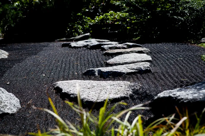
There's a moment in a traditional Japanese garden where the path simply ends. Not because the designer ran out of ideas, but because the empty space ahead — the pause, the breath — is the idea. That deliberate void has a name: ma (間). And right now, in open-plan offices from San Francisco to Seattle, a quiet revolution is underway to bring that same philosophy into the apps living on your phone.
It sounds almost counterintuitive in an industry that has spent the better part of two decades optimizing for more — more notifications, more engagement loops, more reasons to tap, swipe, and scroll. But a growing number of designers and engineers are starting to ask a different question: what if restraint is the most radical feature you can ship?
What Ma Actually Means (and What It Doesn't)
Ma is one of those concepts that resists a clean English translation, which is probably why it took this long to show up in a product roadmap. It's often rendered as "negative space" or "pause," but those definitions flatten something much richer. Ma isn't just the absence of stuff — it's the intentional cultivation of emptiness as a way of giving meaning to what surrounds it. Think of the silence between notes in a piece of music, or the white margins around a piece of calligraphy. The gap isn't wasted; it's load-bearing.
In architecture and design, ma shows up everywhere in Japanese aesthetics — in the open floor plans of traditional machiya townhouses, in the breathing room inside a Muji store, in the way a single branch arranged in a tokonoma alcove commands more attention than a wall covered in art ever could.
For app designers, the translation isn't literal. Nobody's proposing we replace the Instagram feed with a blank screen. What's being borrowed is the philosophy: that deliberate absence creates presence, and that what you choose not to show a user is as powerful as what you do.
The Attention Economy Has a Hangover
To understand why this is landing now, you have to reckon with where we've been. The dominant design paradigm of the last decade was built on a simple premise: human attention is a resource, and the job of a product team is to capture as much of it as possible. Variable reward loops, infinite scroll, notification stacks timed to hit your dopamine receptors at just the right moment — these weren't accidents. They were features.
The backlash has been building for a while. Tristan Harris's Center for Humane Technology put a public face on the critique. Studies linking heavy smartphone use to anxiety and fragmented cognition started piling up in peer-reviewed journals. And users — particularly younger ones — began openly talking about screen fatigue in ways that would have seemed dramatic just five years ago.
But the real pressure is coming from inside the house. Designers who built some of these systems are having second thoughts, and the conversation has shifted from "how do we grab attention" to "how do we deserve it."
Building With Emptiness
So what does ma actually look like in a product?
Some of the most interesting experiments are happening at the level of notification architecture. Instead of defaulting to real-time pings, a handful of teams are experimenting with what you might call batched silence — aggregating non-urgent notifications and delivering them in a single, clearly bounded moment rather than as a steady drip throughout the day. The idea is borrowed directly from ma: create a container for the information, and let the space around it give it weight.
Other designers are revisiting the concept of the empty state — those screens that appear when you've caught up on your feed, or when a folder is empty. Historically, these have been treated as problems to be solved, filled with prompts to invite friends or discover new content. The ma-influenced approach flips the script: the empty state is a reward, a moment of genuine completion that the interface should celebrate rather than immediately paper over.
Typography and layout are another frontier. Generous white space, slower micro-animations, and reduced visual density aren't just aesthetic choices — they're pacing tools. They tell the user's nervous system: you can breathe here. Some teams are explicitly benchmarking the "cognitive load per screen" the way they'd benchmark load times, treating visual clutter as a performance problem.
The Harder Sell
None of this comes free. The honest tension in these conversations is that engagement metrics — the ones tied to ad revenue, to retention bonuses, to the quarterly numbers that keep companies alive — don't always reward restraint. A notification you don't send is a tap you don't get. A feed you don't auto-refresh is a session that ends sooner.
The designers pushing ma-influenced approaches are making a longer-term argument: that users who feel respected by an app trust it more, return to it more willingly, and are less likely to delete it in a fit of digital spring cleaning. It's a bet on relationship over extraction. And while that argument is gaining traction in product circles, it's still fighting uphill against dashboards that measure time-in-app.
The companies with the most runway to experiment tend to be either big enough to absorb short-term metric dips, or small enough that they're differentiating on values rather than scale. Subscription-based apps have a structural advantage here — when your revenue comes from users who choose to keep paying, their wellbeing becomes a business interest, not just an ethical one.
Tokyo as a Template
What's striking about this moment is how explicitly some designers are naming the Japanese influence. Ma isn't being absorbed unconsciously through the general cultural diffusion of minimalism — it's being cited by name in design critiques, referenced in internal talks, and showing up in the vocabulary of product reviews.
Part of that is the broader cultural current that Hibiki Press has been tracking for a while: a growing American appetite for Japanese approaches to craft, restraint, and intentionality, particularly among people who've grown exhausted by the maximalism of the attention economy. When Tokyo's aesthetic sensibility travels, it tends to carry its philosophical underpinnings with it.
And there's something poetic about the direction of that influence. Silicon Valley spent years exporting its design language to the world — the notification badge, the pull-to-refresh, the infinite scroll. Now, the correction is traveling back across the Pacific in the form of a concept that Japanese architects and poets have understood for centuries: sometimes the most powerful thing you can do is leave something out.
What Comes Next
Ma won't save us from our phones. But it might help us build a more honest relationship with them. The designers embracing it aren't anti-technology utopians — they're pragmatists who've concluded that the current model is burning through user trust faster than it's generating value.
If they're right, the next phase of app design won't be defined by what gets added. It'll be defined by what gets removed, what gets slowed down, and what gets the dignity of a little breathing room.
In other words: the gap might be the whole point.


