No Cart, No Checkout, No Problem: What Japan's Vending Machine Empire Is Teaching American Retail
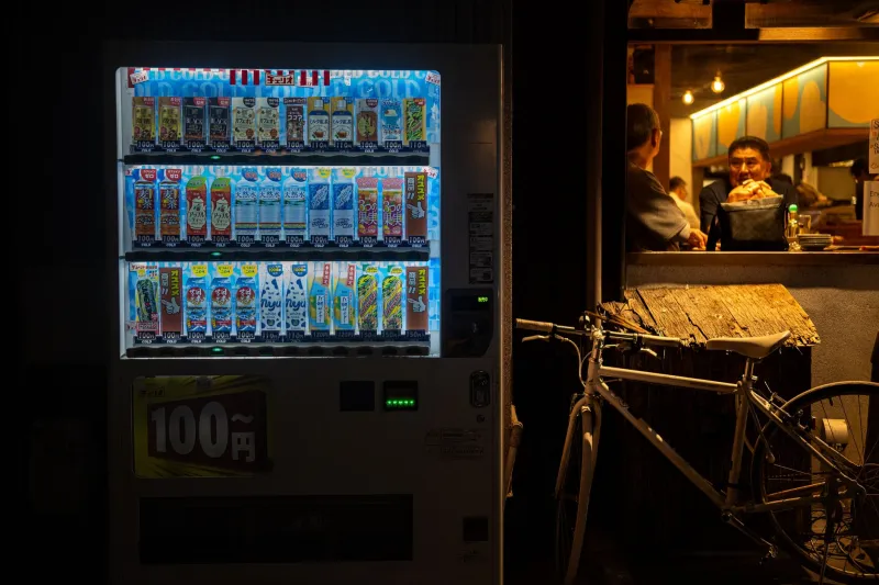
There are roughly 4 million vending machines operating in Japan right now. That's one for every 30 people. They sell hot cans of coffee, fresh eggs, umbrellas, ramen, dress shirts, and occasionally live crabs. They stand on quiet residential streets, inside train stations, tucked into the corners of office lobbies. Nobody thinks twice about them. That's exactly the point.
While American retail tech has spent the last decade obsessing over personalization algorithms, loyalty point gamification, and one-click upsells, Japan quietly built a parallel commerce infrastructure so frictionless that billions of dollars flow through it every year with almost zero cognitive overhead on the buyer's end. No account creation. No loyalty card swipe. No "are you sure you want to leave this page?" popup. You see what you want. You pay. You walk away with it. Done.
For DTC brands, payment processors, and subscription platforms in the US still watching cart abandonment rates hover around 70 percent, that simplicity isn't quaint. It's a competitive weapon.
Friction Is a Design Choice, Not a Fact of Life
Here's what most American product teams get wrong: they treat checkout friction as an unfortunate technical reality rather than something they actively built into their system. Every required account, every address confirmation screen, every "complete your profile to continue" prompt is a decision someone made — usually in service of data collection or internal process convenience, not the user.
Japan's vending machine culture was designed around the opposite assumption. The machine exists to serve the transaction, not to gather intelligence about the person making it. You don't need to tell the machine who you are. It doesn't care. It just needs to know what you want and confirm that you can pay for it. That's it.
This philosophy — let's call it transactional minimalism — is worth taking seriously as a design principle. When a product team asks "what do we need from the user to complete this sale?" the honest answer is almost always less than what they're currently asking for. The extra fields, the mandatory registration, the optional-but-really-not-optional newsletter signup? That's overhead the customer is paying in attention and patience. And they're increasingly unwilling to pay it.
The Impulse Architecture That Actually Works
One of the underappreciated design achievements of Japanese vending machines is how well they handle impulse purchases without manipulating the buyer. There's no dark pattern at work. No countdown timer creating artificial urgency. No "only 2 left!" warning. Just a well-lit, clearly organized display of options at a price point that requires almost no deliberation.
American e-commerce has largely pursued impulse conversion through anxiety — scarcity signals, FOMO-driven copy, aggressive retargeting ads that follow you around the internet for two weeks after you looked at a jacket once. It works, kind of. But it also erodes trust and creates buyer's remorse, which feeds returns, which eats margin.
The vending machine model earns impulse purchases differently: through ambient availability and transparent value. The machine is there when you need it, the price is visible before you commit, and the exchange takes fifteen seconds. The customer feels good about the transaction because it was easy, not because they were pressured into it. That's a fundamentally different emotional signature — and it's one that builds repeat behavior rather than burning it out.
American fintech companies building tap-to-pay infrastructure and BNPL products could take real notes here. The most successful payment experiences in the US right now — Apple Pay at a contactless terminal, Venmo for splitting a dinner bill — succeed because they've stripped the transaction down to its essential components. The ones that are struggling are the ones that kept adding steps.
What Convenience Actually Means as a Product Feature
Convenience is one of the most abused words in American tech marketing. Every app claims to be convenient. Most aren't. Real convenience, the kind Japan's vending machine culture has mastered, means that the product or service removes genuine effort from the customer's life — not just effort that the company found easy to eliminate while keeping the hard parts intact.
Consider what a Japanese convenience store or vending machine operator has actually solved: last-mile distribution to neighborhoods and transit corridors where a full retail footprint wouldn't be economical. Micro-transaction infrastructure that works with cash, IC cards, and mobile payments interchangeably. Inventory management calibrated to hyper-local demand patterns — the machine outside a gym stocks protein drinks; the one in a hospital lobby stocks warm soups and soft drinks. This isn't accidental. It's the result of treating convenience as a core engineering problem, not a marketing tagline.
For American subscription services, that distinction matters enormously. A lot of US subscription products are convenient for the company — predictable revenue, automatic billing, hard-to-cancel flows — while being actively inconvenient for the customer. Japan's model flips that. The infrastructure absorbs the complexity so the customer experience can be effortless.
What DTC Brands Can Actually Steal From This
So what does this look like in practice for an American brand? A few concrete directions worth exploring:
Reduce commitment thresholds. The vending machine doesn't ask you to subscribe before you can buy a drink. Too many DTC brands require an account before a first purchase. Guest checkout should be the default, not the hidden option you have to hunt for.
Price transparently and upfront. Vending machines don't add a service fee at checkout. The number you see is the number you pay. Hidden fees and shipping costs revealed at the last step are one of the biggest drivers of cart abandonment in American e-commerce. Bake the real cost into the display price.
Design for the two-minute decision. The average vending machine transaction from approach to departure takes under a minute. If your mobile checkout flow takes longer than two minutes for a returning customer, something has gone wrong. Audit it.
Think about ambient availability. Vending machines work because they're positioned where people already are, not where the company wishes they'd go. American brands investing in physical retail or pop-up presence should be asking: where is our customer when they actually want this? Not where do we want them to be.
The Longer Game
Japan's vending machine industry generates somewhere north of $60 billion annually. That's not a niche experiment — it's a mature, scaled commerce infrastructure built on a design philosophy that American retail tech is only now starting to take seriously, mostly because the data on friction-driven abandonment has become impossible to ignore.
The lesson isn't that American brands should literally install vending machines everywhere (though some are trying exactly that). It's that the underlying principle — make the transaction so easy it almost doesn't feel like one — is a genuine competitive advantage, not a nice-to-have.
In Tokyo, the machine is always there. It always works. It never asks you for more than it needs. There's something almost radical about that in 2025. It shouldn't be.